Please enter password, or email us to request for access!
This project visualises the experience of being ethnically one,
but linguistically another. Coined as an ethnic-linguistic
dissonance, the research centers language and its scripts as the
interconnecting element in culture, investigating hybrid
experiences through bi-directional trans-scripting, focusing on
both the Chinese and Latin scripts.
Through positioning one's self-perception of identity as a
framework coined as an 'identity-literacy', it bridges the
sense-making of cultural positioning to typographic
mis-recognition and re-recognition, forming hybridised scripts
that appear familiar, yet out-of-place. The research
demonstrates how deeply-integrated language is to cultural
sense-making, positioning what is deemed as dissonant into a
celebrated site of co-existence through the hybridisation of
scripts. See the study of several precedents below.
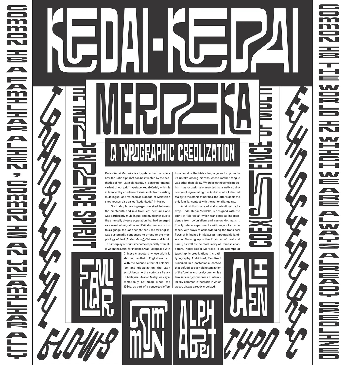
Designed with the spirit of Malaysia being freed from
colonial rule, the inflections of elements from non-Latin
scripts into Latin reflect the cultural and linguistic
hybridity present in Malaysia’s linguistic landscape.
Kedai-Kedai Merdeka visualises the nation’s blend of
cultures, encapsulating new ways of presenting co-existence
through attempting typographic creolisation that is
Arabicised, Tamilisised, and Sinicised into a single poster.
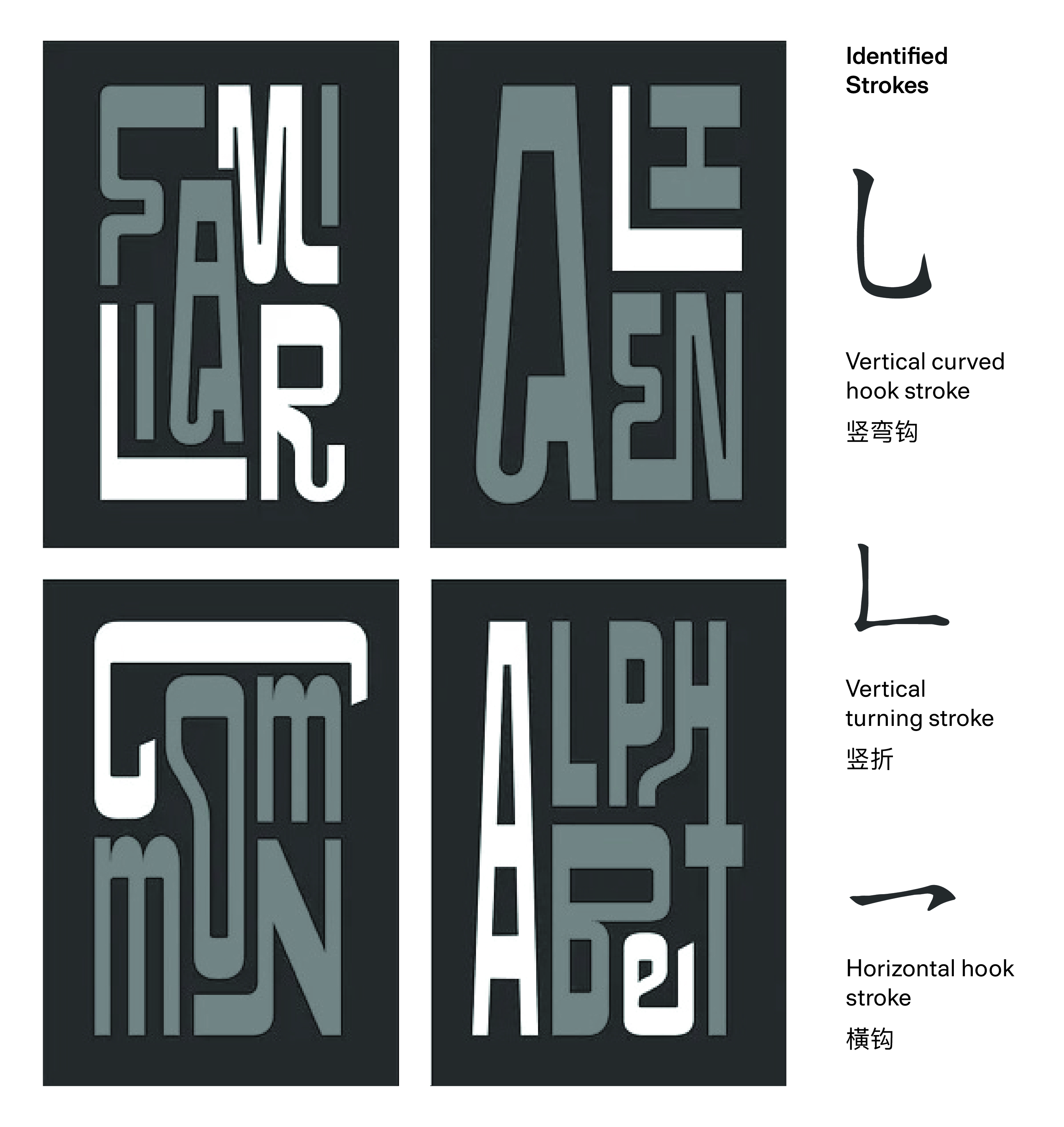
Elements of the Chinese script and its character strokes can
be observed through a few details, such as the vertical
curved hooked stroke (竖弯钩) present in the large
‘Kedai-Kedai’ header, the use of vertical reading flows
across both edges of the poster, followed by the use of
modular compositions of Chinese characters towards the
bottom.
The main distinguishing factor of the Sinicised attempt in
the poster lies in its modular composition. However, only
the words ‘alphabet’ and ‘alien’ contain proper use of
trans-scripting, whereas ‘familiar’ and ‘common’ do not fit
into any of the basic Chinese character compositions.
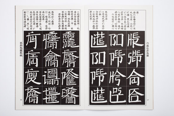
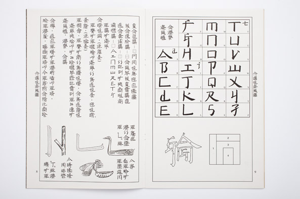
Bing developed a blended species of script that resemble
Chinese characters in Square Word Calligraphy, but actually
consists of English words. Through injecting the Latin
script into Chinese compositions, Bing introduced new
perceptions of cultural norms, stretching notions of the
audience’s perception of language. As a master calligrapher,
Bing was able to blend both scripts together, forming
mixtures of uppercase and lowercase letterforms constructed
with the nuance of calligraphic strokes that fit into the
Chinese character composition.
Rather than solely allowing the audience to interpret the
characters on their own, Square Word Calligraphy was later
on extended to the use of a textbook, an instructional
video, and practice sheets to emulate classroom settings.
Hence, the audience is not only given a guide to help with
interpreting the characters, but are also capable of
learning its constructioin into a square composition.
Among all precedents, Bing's inquiry resonated the most with
what I intended to express. However, there were limitations
with regards to how this relates back to the
designer/scripter. This opened opportunities to not only
trans-script bi-directionally, but to also inject an
autoethnographic perspective to this inquiry through digital
means, producing outcomes that represent personal
limitations faced with the Chinese language.
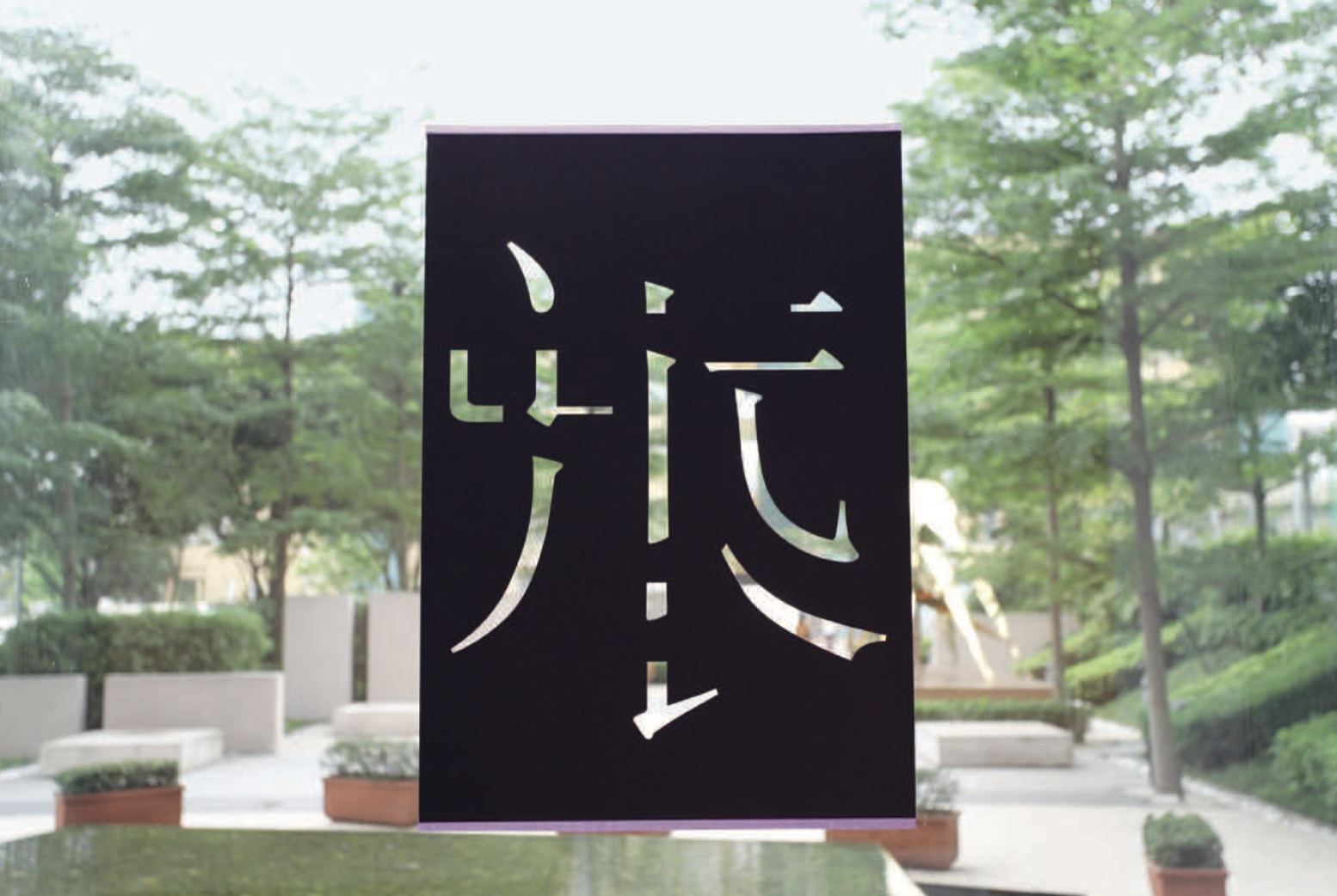
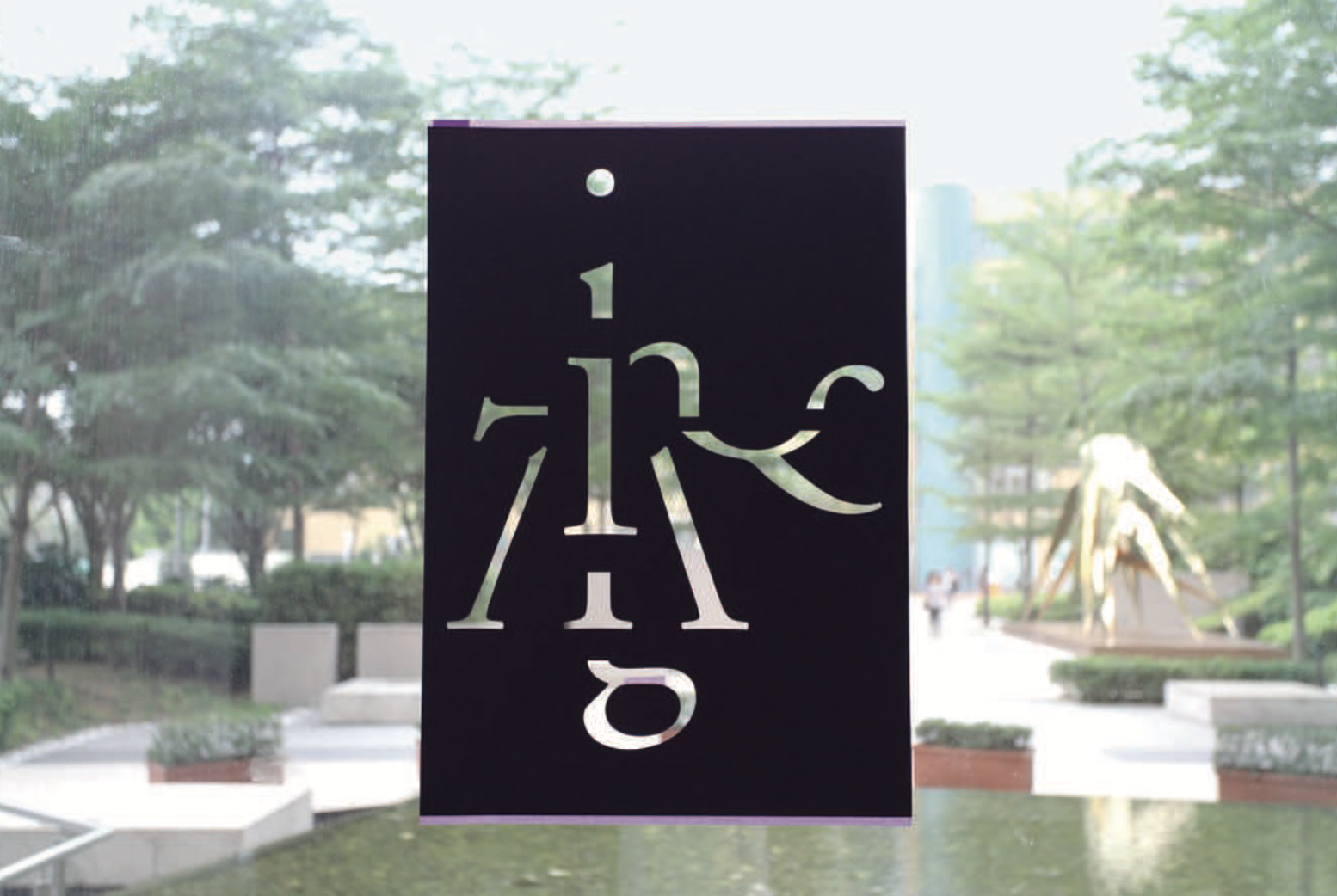
In Hanzi-Graphy, Takagi aimed to demystify general
perceptions that Hanzi characters are incomprehensible and
complex, breaking down its components into what Takagi coins
as ‘micro-typography’. This breaks down the Chinese
character into its smaller parts such as the example above,
elaborated with English typographic terminologies to
demonstrate how they represent more than just pictograms.
Where Takagi’s research stands in contrast to Bing’s lies in
the detailed technicalities of her knowledge in digital
bilingual typeface design, whereas Bing’s takes on
discursive, artistic modes of expression with a focus on
calligraphy. Though Hanzi-Graphy doesn’t directly practice
trans-scripting, it strongly interplays between the
harmonious relationship of both the Latin-Chinese
type/character compositions through the lens of extensive
type knowledge, bridging binaries of language that are
commonly perceived as opposed.
Bing and Takagi's research combined assisted in spearheading
personal trans-scripting attempts, focusing on minute
typographic details between both scripts. Through rigorous
practice, I later developed my own bi-directional system
that was successful across both script's hybridisation,
merging systemic detail with personal cultural expression.